The trend is your friend (well, until it bends at the end).
Cheeky, I know!
But I’m only poking a bit of light-hearted fun here.
9.76 times out of 10 following the trend is EXACTLY what you should do.
But… isn’t it a thrill when you DO nail a reversal point in the market – the ‘bend at the end’ – and watch the market race while other traders scramble for cover?
It’s like the trading equivalent of smacking a golf ball 330 yards dead-straight, over the lake, and onto the green!
You know it can’t happen every day, but when conditions allow, and you do hit the sweet-spot just right, it can keep you grinning for the rest of the week.
So, how can you tell when the market is ripe for such a change?
I thought I’d share one handy technique with you today.
This really is one of the first bits of technical analysis I ever used. I got the bones of it from one of Alexander Elder’s books but mixed in my own price action analysis.
I’ve got an old hard drive at home with screenshots of my very first trades on it. I’ll have a dip into it now and then. It does you good sometimes to remember the journey you’ve been on.
And the moving average envelopes we’re about to look at are all over my old charts.
Have a look at what I’m about to show you and keep in mind the three main ways I think it can help your trading:
3 ways to use Moving Average Envelopes
a) If you’re an aggressive end-of-day trader you can use this to find entry points for counter-trend swing trades.
b) If you’re a trend-following end-of-day trader you can use this as an early exit signal. It can show you the current trend may be due for a correction.
c) If you’re short term trader – a day trader or a scalper – you can use this to set the directional bias for your day ahead. You could even use it to build yourself a low risk position during the day and then let your trade run-on for a day or two.
So, as I mentioned, this is all about using moving average envelopes. And if you’ve not seen them before they’re simple to use. Every decent charting package has them as a standard feature.
They’re simply two additional lines drawn above and below the moving average (MA) itself. And they’re plotted by adding and subtracting a fixed percentage of the instrument’s price from the MA.
The key is to use a percentage value that contains at least 95% of the price action. Each Forex pair will be different and you only need a visual scan over the chart to see when you’ve got it right. It’s not an exact science.
Here’s an example:
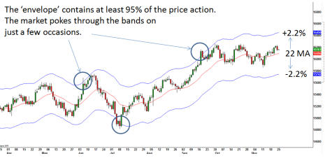
You can use a 22-period moving average to good effect on the daily chart (the red line on the above chart). And in this case a 2.2% upper and lower envelope – the blue bands – contained at least 95% of the price action.
This now gives you a visual channel to help you gauge when strong moves are potentially overextended.
When you see the market out there at one of the blue lines you know you can start looking for a short-term reversal (or at least expect a pause in the current trend).
Here’s a simple three-step process to help you highlight the high-probability scenarios:
1) Wait for the market to touch one of your blue envelope lines.
2) Monitor the price action and wait for a strong reversal candlestick to print in the opposite direction to the prevailing trend.
3) Consider opening a counter-trend position at the close on the day of the reversal candlestick (or close out your position if you had been riding the upward trend). Your first technical target is the 22 period moving average line.
Let’s have a closer look at that chart now to see exactly how those opportunities developed…
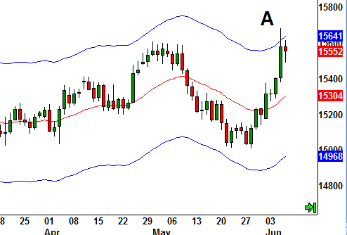
(A): In this first chart the market has taken a run at the top of the upper envelope from the lows of the move at 1.5000. We’ve seen a poke through the upper envelope which puts us on standby. We’re now waiting for a strong bearish bar to indicate a possible reversal.
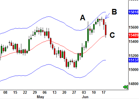
(B): We had to wait a while before we got a strong bearish (red) candlestick – I like to see one that closes below the lows of preceding candle sticks. You can go short at the close of B (or exit any long positions here).
(C): The 22 period moving average is the initial target. This was pinged the following day on this trade. You can close out your short trade for a quick profit or at least pull in your stop loss now.
A couple of weeks later and we’re down at the lower band…
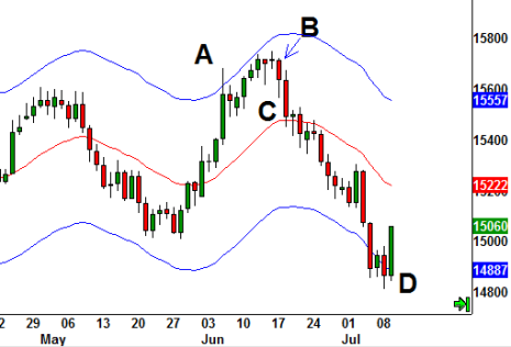
(D): We had a down move that penetrated the lower band. The market paused and then put in a strong Bullish Engulfing candle. Go long at the daily close (and cover short positions).
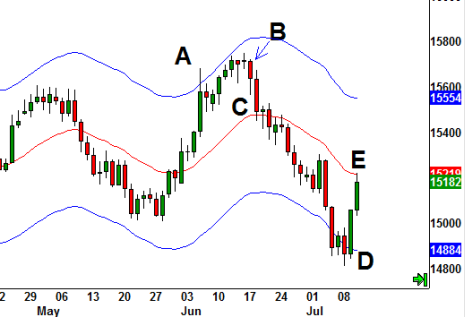
(E): Again, we weren’t kept waiting long for an exit on our trade. The first target (22MA) got hit the next day for a quick profit.
The next opportunity with this technique came after a strong rally…
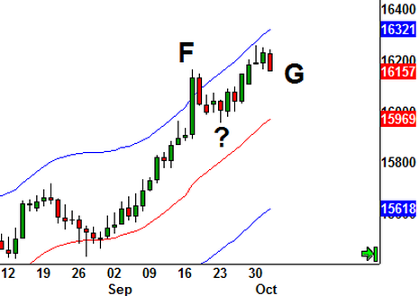
(F): There’s the penetration of the upper band to put us on stand-by. The trend may be stalling but we still need a strong red candle to indicate some bearish sentiment.
(?): And here’s why you need to be careful in filtering out strong entry signals. We got a pullback to this area but no reversal candle to suggest the sellers had jumped in with conviction.
(G): It was around a week later on that bearish engulfing candlestick (see how it covers the preceding green candle and closes below it) before we get the chance to go short.
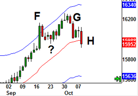
(H): And there’s the target filled a few days later for more profit.
So have a play around on your own charts. Try different sized envelopes on each of the pairs you’re interested in trading and see how often this set-up lets you get involved in good counter-trend opportunities.
Just remember, as with any and all trading indicators, there are NO magic bullets.
These envelopes just help you spot areas where trending moves might – I stress, might – be ready to run out of steam.
You will have to weather the inevitable losing trades along the way, but I do think this is well worth you investigating and experimenting with further.