Imagine an artist scrutinising his almost-complete masterpiece…
Holding hand to chin and with narrowed eyes the artist steps away from the easel and gives his canvas a good check-over from a few paces back.
He steps to the left and dips his head for an alternative view that catches the light in a certain way.
Next, he turns his back and walks a slow semi-circle around the studio before facing the painting again, this time from the right hand side.
Each viewpoint gives him a slightly different perspective.
He might spot something that needs attention when he looks at his painting from left that just wouldn’t be seen in the same way when viewed from the right.
And it’s the same with your charts…
You might run candlesticks as your day-to-day default chart, but when you’re doing your bigger-picture analysis you might look at line charts and bar charts too.
They can all help bring additional bits and pieces to your attention: patterns or price features you might not always spot so easily when running your regular candlesticks.
So let me suggest of small selection of chart types you might refer to regularly. They can help give you a balanced and complete overview of market action.
These 3 chart-types combine really well to give you a complete ‘widescreen’ overview of the market:
1) Candlestick Charts: Probably the default choice of most traders these days. If you’ve been trading for a while you’ve probably used Candlesticks yourself at some point.
(If candlesticks are completely new to you, or if you’d like a quick refresher, you can read more on the Trader’s Nest website here).
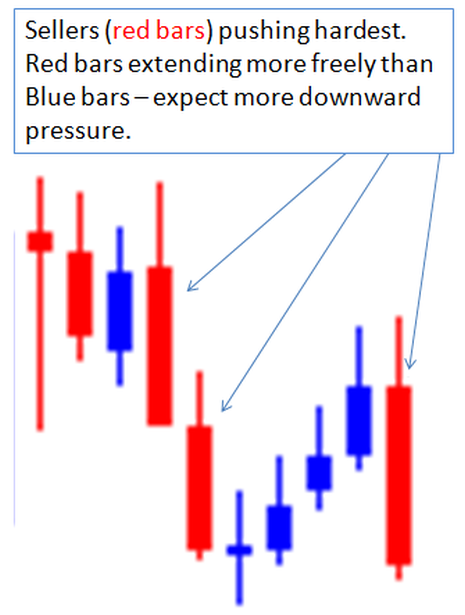
I tend to use candlesticks when I’m looking for potential turning points in the market. I’ll be ready to use them on all timeframes and I pay particular attention when the market is trading near an anticipated level of support and resistance – they help me see how things are playing out in those areas where a pause in momentum or a short-term reversal is most probable. And the good news is there are a hundred and one (at least!) predefined candlestick price patterns to look for.
I like how the strong visual impact of the candlestick lets you quickly see the buying and selling forces in action. Your eye is drawn to the colour-filled bodies of the candles as they print on your screen. They extend upwards and downwards like little pistons and that helps you spot who is currently controlling the action – the buyers or the sellers.
Key Advantage: Candlesticks give you a strong visual overview of the buying and selling forces in action.
2) Bar Charts: You might hear these called Open-High-Low-Close (OHLC) charts. I’m sure you’ll have seen them. They’re those thin vertical lines with a little ‘tag’ on either side to mark the open and close price of the bar. They look like this:
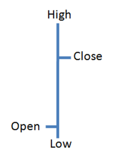
Open-High-Low-Close Bar
Now they might not look as fancy as the candlesticks, they certainly don’t have the same striking visual impact, but I like them for two reasons…
1) You are not so drawn to the bullish/bearish nature of the bars like you are with candlesticks. OHLC Bars can help you take a more objective overview of the longer term picture.
2) You can cram loads more bars on the screen than you can with candlesticks, and this helps areas of support and resistance stand out really clearly.
So this is a different tool for a different job. Candlesticks still definitely have their place but I like to use bar charts to uncover little pockets of price congestion. I find they just jump off the screen with this chart type. Bar charts can help me find price levels that have proven to be relevant to the market on previous occasions and could be expected to provide support/resistance again in future.
Key Advantage: OHLC Bar charts let you cram more data on the screen and see areas of price congestion easily. They can help you quickly find reliable support and resistance levels.
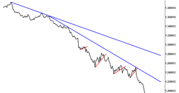
3) Line Charts: The third of my regular chart types is the line chart. It’s just a simple line drawn between the closing prices of the period the chart is measuring. I tend to use these on the longer term charts – the weekly and daily (and sometimes monthly) charts – and it’s just a really clean and simple way to keep focused on the main trending action. Get yourself in tune with the bigger picture on the weekly and daily chart and you can then go looking for specific entry opportunities on the intraday charts. I’m not saying this is the only way you can stay in tune with the longer term trends but I really like the pared-back line charts for their pure simplicity.
Key advantage: Line charts help you concentrate on underlying longer term trends through their clutter-free simplicity.
Line charts are simple and distraction free. Perfect for when you need to
zoom-out and focus on the main trend.
So those are the three charts I find myself flicking between the most, especially when looking at the longer-term big picture.
Am I saying these are the only three charts to use? Not at all, I know traders are out there gaining an edge from Ichimoku charts, putting Point & Figure charts through their paces, and finding great trades with Renko charts.
But as with all things trading, the important thing is to find what works best for YOU, and then build it into your personal trading campaign.
So why not give a new chart chance to shine next time you sit down to analyse the markets?
You might find a chart-type you’ve never really given chance to work before actually gives you a deep personal insight into market movement.