Guest article from Renko Trader’s Jason Alexander
Congratulations!
You’re about to discover a charting method that finally removes all of the noise and confusion of regular charts.
The Renko chart is a simple yet precise tool from Japan.
It’s a form of candlestick chart and takes its name from ‘Renga’, the Japanese word for brick.
It was something really only Japanese traders used, for many years, until it was popularised by Steve Nison in his classic charting book – Beyond Candlesticks.
I’ve been using these charts for some time, and it’s now become an important element of my Forex trading method.
What’s disarming to many Westerners is the simplicity – it can throw you off at the beginning, as we’re so used to technical trading being complicated.
However, once you get the hang of Renko charts, there’s really no tool that’s as precise or profitable.
You can see everything you need to know about a trade in one chart at a glance. What’s more, you can use these charts to:
1. Filter out the noise of wicks as they are based solely on price without time
2. Easily pick out support and resistance levels
3. Confirm trends
You see, a Renko chart contains all the information you need to trade… and nothing more.
Let’s start with the basics…
What do Renko charts look like?
Here’s an example of a very basic chart:
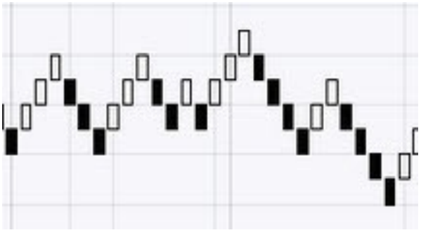
As you can see, the chart is made of ‘bricks’ that range up and down at 45 degree angles, according to the movement of the market price.
The white bricks mean there is an upwards movement in the market.
Black bricks mean a short market move.
The Trading Principles of Renko Charts
Now, you might have heard of candlestick charts in the past?
A candlestick is made up of the open, high, low and close values for a certain time period. It looks like this:
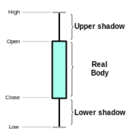
As you can see, the candle has a ‘wick’ – that is the stick coming out of each end, which shows you the high that a price reached and the low that it reached.
A normal charting system that uses candlesticks would have a time base, such as ‘10 minutes’, ‘15 minutes’, ‘1 hour’, etc.
However, Renko charts differ from candlestick charts because they are NOT based on time and don’t have ‘high’ and ‘low’ values.
Because of this there are no wicks on a Renko chart.
This is why they look like bricks, not candles.
Each brick on a Renko chart has a fixed point or “pip” value. This can be set to anything you like – for instance; 2, 5, 10, 50,100 pips. The bricks are drawn based on the change of price only, nothing else.
Imagine this scenario…
• Let’s say your brick size is 5 pips and in a long market. When one brick is closed off the next brick will not be drawn until the market moves higher by exactly 5 pips.
• Now let’s imagine you’re in a short market. The next brick will only be drawn if the market moves down by 5 pips.
Or take a look at this example below.
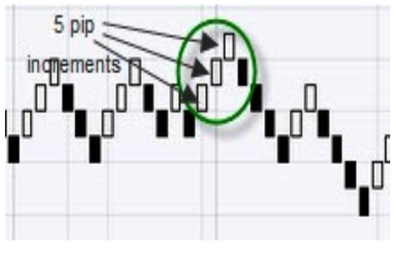
In this previous chart, the “white” bricks have moved and closed three times. Each one is a movement of 5 pips from the close and opening price.
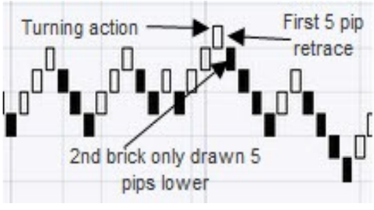
When the price reverses and moves in the opposite direction, here’s what happens…
The first “reverse” brick generated will be double the brick size, as we must first retrace the last brick as the market reverses, and then continue to reverse by a brick length going in the new turned direction.
See the screen shot below.
Okay, so what’s the benefit of all this?
Well, it’s all about trend recognition…
Renko: Superior Trend recognition
A Renko chart is very effective for identifying support and resistance levels. It filters out a lot of the noise, so you can see very clearly what’s happening simply by the shift in brick colours.
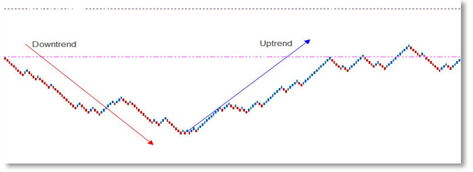
Because there are no “wicks”, only price movement, you can identify uptrends with higher highs and higher lows….
Similarly, you can spot downtrends with lower lows and lower highs. You can see this in the following chart:
So that’s the principle. Now let’s look at a basic trend tool…
How to Find the Trend Direction
Renko charts have all the usual technical indicators on them. But one of the most fundamental tools is “moving averages”.
For instance, you could use a Renko chart with a 200 Exponential Moving Average (EMA) to find the direction of the trend.
If the price is moving above its 200 EMA, then the trend is up. If the price is moving below its 200 EMA, then the trend is down.
In other words…
• You should look to take long trades when the Renko bricks are trending above the 200 EMA.
• You should look to take short trades if the Renko bricks are moving below the 200 EMA.
You can’t really get simpler than that, can you? Because, as the trading maxim goes, “Let the trend be your friend!”
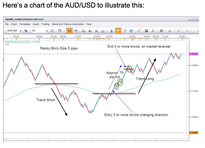
As you can see, the 200 EMA can be seen “snaking” its way across the chart in a wavy line. When the market crosses the 200 EMA going short you should trade short and vice versa.
Of course, the question is, at what point you enter the market? You don’t want to jump in too early and get taken out if the short market was just a blip! Neither do you want to jump in too late and waste all that lovely profit!
Well the good news is I’ve put together a free guide that gives you some simple guidelines on how to spot long or short trends. It also includes the information you’ve just learned here but within the guide so it’s easy to print off and refer back to.
To get your free guide ‘How to Make Money Trading with Japanese ‘Brick’ Charts’ just click on the link here and let me know the best email address to send it to. It’s completely free.