 Price action is one of those trading buzz words that can be hard to pin down. But the truth is that there’s nothing mysterious or particularly complex about price action. It’s more about a different approach and philosophy to trading.
The pure price action trader will clear all technical indicators from their charts – but don’t be misled by this – price action trading is a form of technical analysis. Plus, you’d be amazed at how often we see moving averages and other indicators cropping up on the charts of a “pure” price-action trader!
Personally, I can’t be doing with the sniffy rejections people can take to technical indicators. If they are helping to make price action clearer for you – then great. If they’re just muddling up your charts and your head – get rid of them. Simple as that!
Today I want to look at the three favourite candlestick patterns that price-action traders rely on again and again …
Hammer / Shooting star
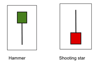
A hammer has a long lower wick, short body, and little or no upper wick. The lower wick should be at least two times longer than the body (the longer, the better). This shape indicates that buyers have come into the market and could be taking control.
A shooting start looks like an upside-down hammer, with the long upper wick, short body, and little of no lower wick. This suggests that the bulls are protecting their gains, and selling pressure is building in the market.
Because the body is very small, its colour isn’t too important.
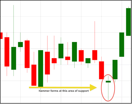
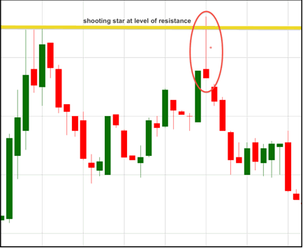
These two candlestick formations are often called “pin bars”, but what’s key about them is where they form.
A hammer is found in a downtrend, and if it’s interacting with an area of support, it is a signal for a bullish reversal.
A shooting start is found in an uptrend, and where it interacts with an area of resistance, it is a signal for a bearish reversal.
Engulfing Candles
One of the best things about hammers and shooting stars is how intuitive and easy they are to spot. Engulfing candles aren’t tricky, but they don’t jump out of your chart at you in quite the same way.
But that doesn’t make them any less important …
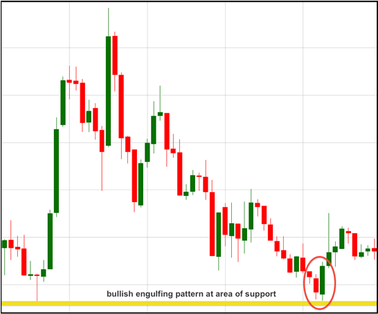
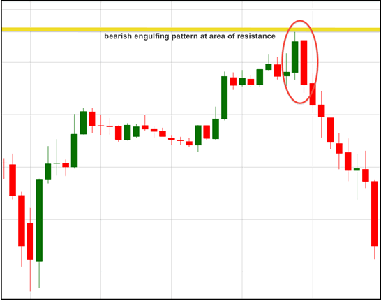
An engulfing pattern consists of two candles, where the second candle has a different colour to the first, and is larger, engulfing the entire body of the first candle.
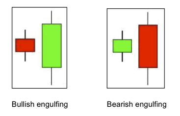
For a bullish engulfing, the first candle is a small down candle, showing that sellers are in control, but because it’s small, volatility is low and sellers are not aggressive. The second candle has a wide range that “engulfs” the body of the first candle and closes up. This shows that buyers have come into the market and overwhelmed the sellers. Where this kind of pattern forms near an area of support, it tells us that buyers are taking control and we can expect a bullish reversal.
A bearish engulfing pattern is the opposite from the bullish. We are looking for this in an uptrend, around an area of resistance. The red body completely engulfs the previous green candle, showing that sellers are taking control of the price.
Piercing Candles
A piercing candle pattern is a slightly weaker version of an engulfing pattern. However, they do give us a picture of traders in some trouble.
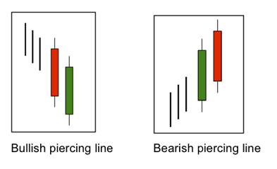
For a bullish piercing pattern, the first candle has a wide range that closes near the bottom of the range. The sellers are in control. The second candle has a wide range in the opposite direction, closing at least halfway into the previous candle. This means that the majority of traders who shorted during the first candle are now sitting on a loss.
For the bearish pattern (sometimes also called a dark cloud cover), the buyers are in control on the first candle, and for the second, sellers take control, pushing the price at least halfway into the previous candle. Again, this leaves a bunch of traders at a loss.
When combined with an area of support or resistance, this pattern gives a reversal signal.
Working with price action signals
One of the most important things to remember about reading price action in candlesticks is that this information is not to be used in isolation.
First off, it relies on price interacting with key areas of support and resistance.
Secondly, these signals don’t tell us how far we can expect the price to move, or where we should be protecting these trades.
For more information about drawing in areas of support and resistance on your charts, check out this posting.