The old trading adage tells us to follow the trend for trading success. In a simplistic world, we would just need to piggyback a strongly trending market and away we go.
Of course, we know that trading is much more complex than this. As soon as we feel confident in the strength of a trend, the damn thing is apt to turn around and reverse on us.
However, there has to be a happy medium, there is no denying the power of trend-following when it goes right. The hardest part is catching those trends before they burn out.
In this article I will show you one indicator which helps you to do just that…
The PSAR Indicator
The Parabolic or Parabolic Stop and Reverse (PSAR Indicator) has been around for a good few years and is now available as standard in most free and premium charting programs.
PSAR is represented by dots which appear below the chart during uptrends and above the chart during downtrends. Although this is not a wholly accurate mathematical analogy, the PSAR can be seen as representing the expected path of an object (in the case a stock market price), based on its previous behaviour.
As an uptrend starts to lose momentum, the price will get closer and closer to the PSAR until it closes below it. This is akin to a goal kick in football as the ball loses its momentum higher and starts to head back down to earth. At this point, the PSAR will appear above the price, signalling the start of a downtrend.
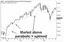
As the chart above shows, the PSAR, like any indicator is not perfect, but does do a reasonable job of representing the overall trend.
The most common use for the PSAR is to use it in setting stops on active trades. For example, in the chart above, you could have used the PSAR as a useful stop when the S&P reversed around the end of February. The idea is to stop when the market hits the Parabolic, then reverse the trade to go in the opposite direction, hence the name.
However, I recently discovered that simply using the PSAR for setting stop losses doesn’t even scratch the surface with the versatile indicator.
The Parabolic Yawn Indicator
Inspired by some ideas put out by the innovative David Varadi I wondered if the PSAR could be used to spot when a trend has become too stretched in one direction or the other.
There are many ways you could look at this from measuring the amount of time the market has been above the Parabolic or the size of the difference.
I have looked into both and found very similar results, but will share the impact of size difference in detail because this seems to have the more powerful effect.
The general conclusion is this: The greater the distance between the current price and the Parabolic Indicator, the more likely the market is to reverse in the opposite direction. Specifically:
• The further the market is above the PSAR, the more stretched the uptrend is, making a big reversal more likely.
• The further the market is below the PSAR, the more stretched the downtrend is, making a big rebound more likely.
In order to investigate this I have invented what I’ll call the Parabolic Yawn Oscillator (PYO), this borrows heavily from the excellent work of David Varadi who put out a similar Parabolic Stretch Oscillator which measures stretch in terms of time, whereas the Yawn Oscilator measures stretch in terms of size. For the PYO, in effect we are looking for instances when the distance between the PSAR and the price get overstretched; it will soon shut like a yawn.
This produces two separate indicators:
Up Yawn stretch: For days with the price above the PSAR, measure the difference between the price and the PSAR then rank how big this difference is for the last 50 days (per cent rank).
Down Yawn stretch: For days with the price below the PSAR, measure the difference between the price and the PSAR then rank how big this difference is for the last 50 days (per cent rank).
The ranking over the last 50 days helps the indicator adjust to the present volatility seen in the market.
The indicator then varies between 0 and 100, a high score means the price is stretched far away from the parabolic indicator.
MetaTrader Indicator
With considerable thanks to Daniel Fernandez, you can trade this brand new indicator within MetaTrader.
You can download the indicator here.
Once installed you will see two lines: Up Yawn in green. Down Yawn in red.
The Up Yawn will rise as the price increases, while the Down Yawn will rise while the price decreases.
The indicators will vary between 0 and 100 with 100 indicating a big stretch between the price and the parabolic and a low score indicating the price is close to the parabolic or is on the opposite side of it.
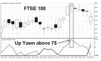
Below you can see a chart of the FTSE 100 with the Up Yawn in light grey and the Down Yawn in black. At the point noted, the Up Yawn hit 100, indicating that the market was the most stretched that is has been for over 50 trading days.
An entry any time around this point would have offered a very poor risk-reward with the market topping exactly at this point. The best return from this period would have come from the start of the uptrend when the Up Yawn was below 50.
Performance and application
I have tested the Parabolic Yawn Oscillator on a number of markets including the FTSE 100 and the US S&P 500 and found it to have positive implications. Forex markets unfortunately do not suit the indicator, possibly because of their strong trend-following nature meaning a trend can stay overstretched for some time.
The best market for trading as with many methods I’ve looked at in recent years, is the US S&P 500.
I’ve marked a few recent examples from the Yawn Oscillator.
I tested the Up Yawn and the Down Yawn separately on the S&P 500 going back to the year 2000.
The trades were long only. Here are my findings:
Up Yawn:
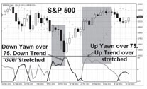
The first column shows the strength of the Yawn Oscillator. For example >50 means the Up Yawn score was recently ranked as being in the top 50 highest scores for the last 50 periods. A score of >75 means the Up Yawn score was very high, in the top 75% of scores for the last 50 periods.
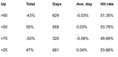
The second column shows the total return of all days matching that condition. The third column shows the number of days matching this condition. They are not equally divided because the S&P 500 has spent more time heading lower than higher since 2000. “Ave. day” is the average daily profit or loss on the particular day and the hit rate shows how likely that day is to finish higher.
We can see that when the Up Yawn is above average >50, the overall returns were loss making, but when the UP Yawn is below average, the overall returns have been profit marking.
This means that the Yawn oscillator is doing a very good job of spotting when a trend has become over stretched as represented with a score of >50 or higher. Indeed, when you look at days when the Up Yawn score is greater than 75% (very much overstretched), the returns are extremely poor. In these cases, the average day makes a loss of -0.08% with less than a 50% chance of closing higher.
Down Yawn:
The Down Yawn shows a similar pattern but in reverse. The more stretched the downtrend, the more likely it is to reverse and go higher. Indeed when the Down Yawn scores greater than 75%, the average day returns 0.07% and is higher 56% of the time.
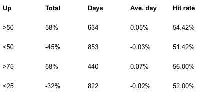
This contrasts considerably with the results from going long with the Up Yawn, which is above 75%!
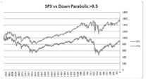
Below is a chart of a strategy that went long when the down PYO is above 0.5 – i.e. the market is overstretched below the PSAR. As you can see, things got a bit funky around the time of the credit crunch, but overall it does a reasonable job of capturing the bulk of the gains since 2000 from less than half the number of days.
The bottom line
So it seems the hypothesis was correct. In general, the greater the difference between the PSAR and the current price, the more the market is stretched and likely to reverse. No doubt returns could be improved further with tinkering or used in combination with other strategies such as improving short-term overbought or oversold indicators by trading them in line with the Yawn Oscillator.
The Yawn Oscillator works best on stock markets such as the S&P 500, the FTSE 100 and some individual stocks. It is best applied when looking for long trades only and choosing when to take money off the table, short trades are profitable but more volatile so are best avoided. Sadly, the Yawn indicator has little application to Forex markets where a big stretch can often lead to an extended move in the direction of the stretch instead of the reversal consistency we see on stock markets. However, gold has shown some promise recently as the screenshot below shows:

You can download the Yawn Oscillator for MetaTrader here.
Bonus: Download the Parabolic Stretch Oscillator
There are two ways to measure the stretch between the current price and the Parabolic: by the size of the stretch (The Yawn Oscillator) or by time. The Parabolic Time Oscillator (PTO) was first conceptualised by David Varadi and you can find more details on this post here. Unlike the Yawn, the PTO counts the number of days the price has been above or below the parabolic and ranks this amount of time to put it into perspective.
Similar to the Yawn Oscillator, the PTO looks for periods when the trend is long in the tooth, with a high score above 75 likely to lead to a reversal of the trend. In fact the PTO works best when you examine extreme levels.
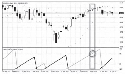
Below you can see a chart of the FTSE 100’s recent trend. I’ve marked the point where the PTO (Yawn time) hit 75, signalling that the uptrend was overstretched in terms of the amount of time spent above the parabolic. It shows that the point where the PTO (Yawn time) reached 75, the trend had overstayed its welcome and long trades here would have offered a poor risk-reward.
That kind man Daniel Fernandez of http://asirikuy.com has been busy again and coded the PSO in a format to be used in MetaTrader.
You can download the PSO Indicator for Meta Trader here , the file is called “Yawn Time”.