It’s not often that our charts look like the ones in text books
So, when we get a lovely neat bounce, bounce, bounce like this, it’s impossible to resist…
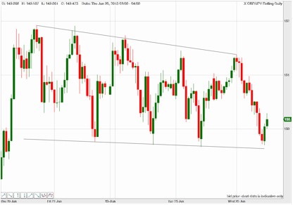
This is the hourly chart on GBPJPY, and it’s been bouncing very neatly in a downward range since Thursday last week.
Prices moving within a clear range are a great opportunity to snap up profits – buying each time the price bounces up, and selling each time it falls down. But these lines alone aren’t enough to risk our money on.
The skill you need in your arsenal for this kind of situation is recognizing which candlesticks confirm the move.
And which give you a warning that a breakout might be about to happen.
So, let’s zoom in on some of those turning points…
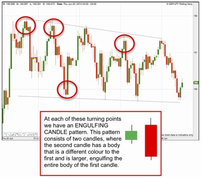
The four turning points highlighted above each show engulfing candles.
For a bearish engulfing candle, we’ll see a small up candle – showing that buyers are in control, but because it’s small, volatility is low and buyers aren’t aggressive.
The second candle is red and has a wider range that ‘engulfs’ the body of the first candle. This tells us that sellers have come into the market and overwhelmed the buyers.
A bullish engulfing candle is the opposite – a short red candle followed by a large, ‘engulfing’ green candle.
Engulfing candles are a very powerful indicator of the sentiment among traders. They are extremely useful to traders as a strong signal, plus (unlike some candlestick patterns) they crop up all over the place, giving us confirmation of trades again and again.
However, there’s a downside to engulfing candles: the fact that the second candle is usually a large one often means that there’s been a big move in our direction already.
And if we’re using an engulfing candle as a signal to trade – we may have already missed a good chunk of that price move.
Next I want to look at a slightly weaker indicator, but one that will often leave us a better slice of the profit potential…
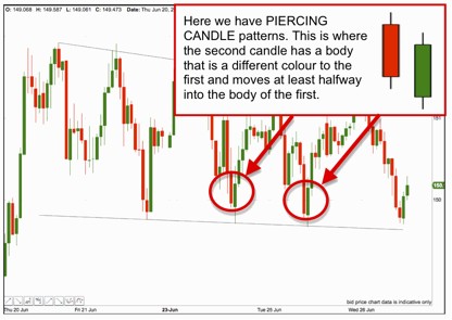
Here we have two bullish piercing candle patterns.
The first long red candlestick tells us that the sellers are in control.
But the second, green candle shows us that the majority of those who shorted during the previous candle are now sitting on a loss, and many will be looking to jump ship.
The benefit of a piercing candle is that it’s often smaller than an engulfing candle, which means that we can get our signal and be into our trade all the sooner.
The breakout
So, here we are with the price going bounce, bounce, bounce, and we pick up profit, profit, profit all week long. Right?
Well, not exactly.
This is what happened next…
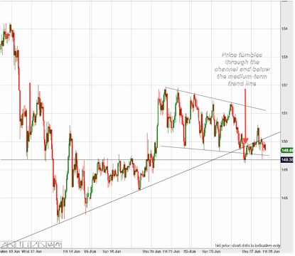
So, what went wrong?
Of course, prices will never stay range-bound indefinitely – every time we come near to a boundary, we need to be ready and waiting for signs of a breakout.
And this is the Japanese Yen – as we discussed a couple of weeks ago: this currency is wildly volatile right now.
Economic data has put strong downward pressure on the pound. Meanwhile, we need to be aware that the Yen is weakening against the US dollar. This leaves the GBPJPY squeezed in the middle of these two forces, and we can see the makings of a descending triangle pattern on the chart above.
But there’s one final candlestick that gives an important part of this story. It’s on the daily chart for the same period…
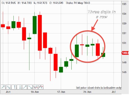
Doji candles like this, with long wicks and small bodies, are telling us that the market is at a deciding point, and the direction it moves off in after this is a big clue as to where this breakout is heading.